The objective of this project was to re-create a pasta brand. This included creating a logo using typography and color schemes, designing the packaging for the pasta brand and executing the design for the packaging.
Although the original design of the logo was effective, I felt that along with the fun flavors there should be a fun design. And lets face it, its a hard name to pronounce, (sfo•gli•ni). Which leads me to the design inspirations.
Inspiration
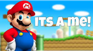
If you have a hard name to pronounce, you need a fun image to be remembered by. Every-time I say the name, I think of my childhood and Mario saying one of his most iconic phrases..
Sketches
After the name was finalized, the logo process began.There needed to be a fun element in the typography to compliment the fun design, typography, and color. In the beginning stages of sketching, it was obvious the image would be the most important element, but the typography must contribute to the image without taking any attention away from the memorable image.
Color Scheme and Typography
Final Logo
Conclusion
This brand will be a favorite for parents and children alike. The parent will enjoy the healthy types of pasta and the children will love the design. This has been one of my favorite projects and really challenged me as a designer.
Like What you See?
Does your company need help with re-brand, layout or print?